A la fin de l'année 2011, deux textes ont été publiés en préface de catalogues.
Un texte pour ZEVS, en préface de son catalogue monographique publié par la De Buck Gallery, New-York, dont je remets le texte, en anglais, ici.
Et un texte pour Emmanuelle Leblanc, en préface du catalogue de son exposition à la Galerie KH15, Berlin, sous le titre "A melancholy for the here and now", et que je republie ici, en français.
ZEVS
From the sidewalks of the cities to the walls of art galleries, Zevs reacts to the city signs and to the codes of consumerism. His work deals with the public area as well as with what art represents and the relation between art and the consumer society. Zevs was only twelve years old when he started making graffiti on the walls of his neighbourhood.
He first sprayed his name on the walls, as if he was marking his territory. Then there was a reaction to the advertising saturation, perceived as coercive.. All this finally opened to a reflection about what living in cities nowadays is like. Little by little, he sketched out a really original graphic, plastic and semantic language. Today, Zevs is widely contributing to the recognition of street art as an essential form of contemporary art. Even though just a little bit older then 30, he was able to find his place in European galleries, but he still goes on working in the street. The street, as Daniel Buren said in the 60s, remains his real studio.
 Zevs, like many French graffiti artists, inherited the hip-hop and graffiti culture from when it emerged in New York during the 70’s, until it was exported to the European capitals in the 80’s. But there is no doubt that he has been part of this New Wave of artists who have come from the graffiti universe, who knew how to synthesize differents genres. At the crossroads of street art and underground art, his work also deals with the pop culture, the cinema, anti-authority culture, painting and Art History.
He is also a part of the interest that the French had for graffiti as a ephemeral form of art brut, long before the first writers in the New Yorker subway. In 1960, Brassaï, a French photographer of Hungarian descent, published a book called “Graffiti”, in which Picasso took part. And when at the end of the 90s, Zevs ironically wrote in “Proper Graffiti” – a technique he forged, consisting in using a high pressure water blast that removes the grime on the wall for writing clean- “I mustn’t dirty the walls of my town”, this is evocative of the militant graffitis that appeared in May 1968, on the walls of Paris, such as “It’s forbidden to forbid”. Seen as an “an urban guerilla artisan ”, Zevs, through his interventions, preaches a critical, structured and tough activism.
The first thing that gets our attention in Zevs’s work is of course the way he plays with the street art codes to appropriate the city walls, it's vocabularies, its logos, it's architecture and it's street fittings. He perpetuate them, reveals their flaws and finally leaves his trace. But Zevs’s statement is transversal. It unfolds between several subjects and several territories: those of communication and advertisement in itself, that he turns inside out and perverts the codes, such as in the “Visual Attacks”, in 2000 or in the “Liquidated Logos”, now; those of the theater, the happenings and the performances; those of the art video at the edge of the documentary film; and finally those of the cinema, between blockbusters and experimental movies.
It all began like a teen movie. An alternative teen movie. From the window of his bedroom, the teenager saw some graffiti artists writing on the fences of a wasteland. At twelve years old, the kid, who wasn’t Zevs yet, was making graffitis on his way to school, on the walls of his neighborhood. When he was arrested for the first time, the Parisian police treated him like a real little criminal, keeping him a few hours in the police station. He still remembers that. Subsequently he was arrested a dozen times, until he decides not to get caught again. But, all these misadventures gave him the taste for a kind of cat and mouse game with the police, but an aesthetic one. The police aesthetics, the thriller or film noir codes, with their crimes and their serial killers, became something like a gimmick and this started to be a sign of his presence.
Zevs-the-outlaw commits artistic offences, and the street becomes the wider scene of the crime.
The crime scene: a street, at night.
The weapons of the crime: some white road paint, a brush.
The crime: At nightfall, Zevs went hunting in the city. At the end of the 90s, Paris was “overpainted” with graffiti. Zevs tried to find other surfaces than walls to leave his trace. He embarked on a quest to find another place in town. Finally he chose the most unnoticed place in the city. He started capturing the shadows of the town, by outlining the ghostly presence of the Parisian architecture and of the street fittings under the street lights. These “Electric Shadows” (1998-2001) perpetuated what already existed: the traffic lights, the monuments, the bridges and even sometimes the passers-by. These bright white lines on the asphalt show their potential unseen presence to people's eyes. When he revealed this invisible mirror image of the street, Zevs, the so-called “Shadow Flasher”, opened up some new territories and captured a slice of the evanescence of the city. In the daylight, these white shapes meant nothing. It was a kind of graphic and furtive poetic. Sometimes, his Shadows were political ways to talk about the contemporary urban reality. One night in New York, he caught the shadow of a sleeping homeless person, a shadow among the shadows. At other times, a kind of impressionism, a cinematographic way to catch the night time urban atmosphere which could recall unsorted images of films from Cassavetes, Scorsese, Jarmusch or from French thrillers.
When he was working on his Shadows, Zevs used to close the area with a plastic tape like the police : “Crime Scene- Do not cross” becoming an “Art Crime Scene – Do not cross”. As strange it may seem, few people, nor even the police, found this unusual.
When Zevs finished his work by taking photos of it, it was of course to keep traces before the clean-up crews would get rid of it. But he also thought about Weegee the Famous, this photographer who was shooting bloody crime scenes....Art crime is his business...
Zevs likes to play with the cinematographic codes, and there is nothing more photogenic and more cinematographic than a city at night. For him, the city is not only a support, a playground, but also a full character, a protagonist in the story that he is writing.
Like in a film noir, the city at night is an atmospheric backdrop, which is a recurrent preoccupation for the artist. Zevs’s work constantly deals with shade and the light, the day and the night, the visible and the invisible. As a criminal would leave some clues in his flight, he leaves behind him in his night wanderings more or less discernible traces, which are revealed.
Night disclosure in the black light for his « Invisible Graffiti »- For three years, Zevs has tried out this special kind of graffiti made with fluorescent paint that can only be seen under black light, artificial or UV-filtered light. He outlines the cracks and the rifts on the building walls, uncovers the scars of the town, and streaks the architecture with electric lightenings. He performs large-scaled “Invisible Graffiti”, such as on the façade of the Glyptotek Museum in Copenhagen.
 But there were some times when the clues were bloodier. One night in 2001, Zevs changed into a serial killer, a serial ad-killer. He started to shoot methodically and equally men and women, provided that they were handsome, unlined and dehumanized by the magic Photoshop. A red splash sprayed right between the eyes of the models on the commercials, with dribbles of blood-red paint dripping on their faces. The sabotage is efficient. The “Visual Attacks” are frontal attacks against the omnipresence of advertising in the urban landscape as well as a manner to mark off its huge power of suggestion. Doing this, he disrupts the trade reading of the image and obstructs the identification of the passer-by with the bloody model. So Zevs hijacks the power of the image to his advantage.
Street by street, he left in his course the bodies of top models, executed in the cause of rejecting of all conventional lifestyles. As a signature, he left on the poster a photo of himself masked, just to taunt the police. In 2008, he reoffended with the “Visual Rapes”. This time the attacks were aimed at the icons of our world where everything becomes Pop: Marilyn Monroe or Mona Lisa, Che Guevara or Albert Einstein, Columbo or Superman. The photographs were stolen from the Internet. Their faces were obliterated with a flash-effect in Photoshop, but we know them so well that we still recognized them. However they were no longer images, but blurred depictions, shades, shapes.
Zevs is a dangerous mass culture killer. He knows the meaning of what Roszak called “Counter-culture”.
His artistic expression is an opposing force based upon the power itself. “ As in Aikido, I reverse the power to change the flow to my advantage”, he often says.
One of his most significant works about this reversed power is the “Visual Kidnapping”, written like a thriller.
The « Visual Kidnapping » was a lengthy performance that began in Berlin, in 2002 and finished at the Palais de Tokyo, in Paris, in 2005. A fifteen by fifteen meter poster on the Alexanderplatz. An eight-meter girl, muse of the coffee brand Lavazza. Later, Zevs will tell to the French newspaper Libération: “Armed with my scalpel, I climbed the front of the hotel where the Lavazza poster was boarded. An hour and a half later, the hostage was mine and I left the place, leaving behind me a hole in the poster and a sentence: VISUAL KIDNAPPING- PAY NOW!”. A paper chase began between the brand and the artist. He demanded a ransom of 500 000 Euros, which equalled the cost of a marketing campaign. The German subsidiary company filed a complained against X. On the Alexanderplatz, people were coming to look at...the hole in the poster. A few days later, he showed the Lavazza girl at the Rebell Minds Gallery, a few meters close from the kidnapping scene. The day after, the police turned up but Zevs had already left Berlin, with the hostage folded in a suitcase. For months, he sometimes showed, sometimes hid the hostage. Finally, he sent to the company CEO, an anonymous letter of ransom. On a Website and at the Patricia Dorfmann’s gallery, in 2004, people could vote whether or not the hostage was to be executed. In 2005, after numerous negotiations, an agreement was found between Zevs and Lavazza, who would give to the artist a fake check. In the form of a happening, this conclusion was justifiably seen as a hijacking of an anti-ad subversive strategy turned into a huge media event for this brand that proclaimed “Express Yourself”! In Germany, the “Visual Kidnapping” inspired others activists , who kidnapped many others ads.
Zevs learned from this experience. He started to distanced himself from the brands. Since then has attacked the logos, to “liquidate” them, many luxury labels have contacted him, but he has always turned down their proposals. He maintains that position when he liquidates, in his gallery in Zurich, the logo of Vuitton re-designed by Murakami. The “Liquidated logos” began in Berlin, in 2005, with a Nike swoosh, then with the logos of Coca-Cola and Mac Donald’s. Now he works on the logos of the luxury trademarks, that he duplicates in order to liquidate them in the galleries. Making them liquid, Zevs visually attacks their symbolic function. He develops his critique by further examining the power and the promotion of the advertising signs. A keynote of a brand identity, the logo durably interferes in the people’s emotional landscape. It’s an extremely efficient “silent buyer”. When he liquidates the well-known logos of Chanel or Vuitton, Zevs attacks a network of signs (of identification), of (social) codes, of meanings and of emotions. A logo digests a world. By a suggestive opposing force, its metamorphosis by being liquidated brings to mind over consumption, the tyranny of advertising, apparences and the vulgarity of ostentation. At the same time, Zevs clearly keeps the ambivalences when he appropriates the logo to produce his work and when he gives to it a new aesthetic. By doing this, he confirms the logo is an aesthetic object.
 The liquidation performed in Honk Hong in 2008 is probably one of the most interesting ones. On a stage, the artist starts by tattooing the logo of Chanel on the naked back of a woman. The image of this very famous acronym, so exciting for so many women, the letters bleeding on her waist, is extremely striking and efficient. It reminds us of Man Ray’s violin. It recalls an Ingres’s bathing beauty that would make us think that voluptuousness would be no more to nudity than the brand that clothes her. It’s also the violence and the sensuality from Peter Greenaway’s “Pillow Book”.
According to Zevs, every artistic space – both literally and figuratively- is a possible space for a performance, a story, a scenario. Most of his projects, the films he makes from them are always meticulously written and cut. For example, the film that relates the story of the “Visual Kidnapping” is written like a thriller, and even the documentary film talking about his exhibition at the Glyptotek Museum in Copenhagen keeps us in suspense. One of his last photographic series, called “Cold Traces”, shows some strange foot steps in the snow. Zevs says: “I was walking alone in the mountain with a red spray can in my bag. So I was wondering what I could mark in this new and immaculate territory. After two hours of walking , I turned around and saw my traces in the snow. Then I had the idea to paint them and so to prolong them and outline what already existed.”. These blood-red foot steps in the snow throw us into a frightening atmosphere, with a premonition of violence: something between “Fargo”, “A simple plan” and the Parcival Everett’s novel “Wounded”. “I also thought about “The Shining” “, Zevs says, and at the same time, he also thought of a Rothko’s painting, with the blurred outlined red watered down in the bluish snow.
Zevs’s work devellops like a baroque and heroic opera, it's very theatrical.
Zevs totally assumes this dramatic dimension to his work. The choice of his name, Zevs, is the code-name of a suburban train that almost crushed him, one night when he was writing in a dark railway tunnel. But, the V instead of the U, the name of the Greek mythological god of gods refers to an other mythology, the mythology of the superheroes, which inspires the character that the artist has created. A yellow working jumpsuit, a leopard-printed scarf hiding the face, a hat, a pair of gloves: in his artistic life, Zevs is incognito and few people know the real face of this discreet young man. He’s Clark Kent and Superman. Moreover, the logo that he created crosses the graphics of the yellow triangle on the voltage transformer in the Parisian subway and the logo of the Siegel and Shuster’s Kryptonian hero.
« I wanted to create a role, a persona, and to work at a distance, behind this image”, he explains. It’s like a questioning about the representation and the distance. The artist, who was also an actor, knows what Brecht called the “distance”, this gap between what is given to see and what is real, this strangeness, stimulating people to think about the reality. Everything in his work as well as in the role that created deals with this gap.
Like in Comic- books, is Zevs an urban hero, produced by the urban jungle and the neurosises of the modern world ? Probably he is not. He remembers that in a story of Superman, when Superman gets in contact with the Kryptonite, he looses his strenght and his logo liquefies. Zevs owns a stone from somewhere else, called “Zevsonite”. At its touch, the trademarks dissolve. He uses the mythic power of the superhero to reverse its energy and to stigmatize the disintegration of the images and of the signs.
In fact, Zevs is nor a superhero nor an antihero. He’s a “counter-hero”.
EMMANUELLE LEBLANC
"Une mélancolie de l'immédiat"
L’espace et le temps, nous le savons, sont les deux dimensions qui conditionnent a priori toute appréhension du monde. Aucun monde, aucune expérience ni aucun savoir sur ce monde ne peut apparaître à nos esprits sans elles. C’est alors à une singulière expérience que nous convie le travail d’Emmanuelle Leblanc par leur prisme, y ajoutant celui de la lumière, qui les traverse de part en part pour faire advenir l’image. Saisir le monde n’est pas se soumettre passivement à des réalités extérieures, mais le soumettre au contraire aux règles de nos perceptions et de nos jugements. Emmanuelle Leblanc propose ainsi des modes de regard, dans une tentative de capter quelque chose aux racines de ce monde que nous nous donnons à voir, le dévoilement d’une aletheia peut-être, sorte de vérité cachée sous le flux des images médiatiques, flux de plus en plus rapide et fugitif. La simplicité nous pousserait à dire qu’Emmanuelle Leblanc opère des « arrêts sur image », saisissant ainsi une vérité qui se serait trouvé en elle mais aurait été soustraite à notre attention. Mais sans doute la réalité des peintures d’Emmanuelle Leblanc est-elle plus complexe que cela.
 Comme pour de nombreux peintres de sa génération, dont la sensibilité s’est nourrie à travers l’omniprésence de l’image - télévision, cinéma, publicité- mais aussi de l’évidence de la technologie, cela commence par une photographie. « J’ai toujours aimé les photos mais j’ai toujours eu plus d’estime pour la peinture. » dit l’artiste. Estime accordée à ce médium plus qu’ancestral, peut-être tant par intérêt pour l’histoire de l’art que pour la part de vérité autre que la peinture recèle. C’est donc d’un processus de « pictorialisation » de l’image photographique qu’il s’agit ici, dans lequel, d’une manière ou d’une autre, en conservant les scories ou en les soustrayant, l’artiste entend révéler quelque chose de l’ordre de l’épure et de l’essentiel.
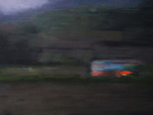
Examinons d’abord les oeuvres composant la série de la « Ligne de peinture ». Ici, donc, des photographies prises sur le vif, avec un téléphone portable. Sujets a priori ordinaires et sans qualité, sans hiérarchie ni logique dans ce qui est donné par le réel. Mais cette sorte de neutralité dans l’apparent non-choix des prises de vue est finalement contrebalancée par l’évidence esthétique –formes et couleurs- de l’image. Apparaissent alors : une tâche de couleur vive sur un fond ombrageux, un paysage presque classique, des jambes de fillette, des compositions parfois abstraites dans leur fugitivité…des fenêtres peut-être, la silhouette d’un marbre classique dans quelque musée, un clair obscur presque romantique à la Caspar David Friedrich, un Rothko, une façade d’immeuble constructiviste…Wilde affirmait que la vie imite l’art non le contraire. Il y a dans cette série d’images, quelque chose de cet ordre, dans la manière dont Emmanuelle Leblanc capte, et restitue, le surgissement fortuit de l’histoire de l’art dans la banalité du quotidien et suggère de manière sous-jacente comment cette réalité en est une nourriture perpétuelle.
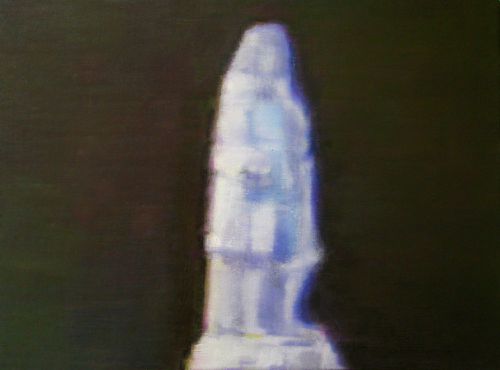
Dans le même temps, à dessein, les lieux, les temps, les espaces sont sans définition, notre perception tirée hors des lieux, des temps, des espaces, aspirés dans une brèche que l’artiste aura ouvert. Hors de l’histoire aussi. Cet ensemble de peintures modulaire, constituant une « phrase picturale » à la construction à la fois intuitive et formellement harmonique, ne raconte pas une histoire mais des possibles. Elle peut être interprétée comme une série d’expérimentations, de tentatives, d’essais, une sorte de laboratoire d images jetables que l’artiste dans son geste aura tenté de sauvegarder, d’arracher à l’oubli nécessaire du flux temporel et médiatique, dans un souci de les ériger en « modèles picturaux », mettant, explique-t-elle, sur le même plan d’égalité toutes les typologies et les genres picturaux « « paysages », « natures mortes » et « figures » » autant que « des motifs plus abstraits ou de quasi monochromes ». Car ces petites peintures, dans leur égal format, leur sérialité, n’énoncent en effet rien de fictionnel, ni de narratif. Le regardeur pourra bien vouloir y introduire une logique fictionnelle, créant des liens, des histoires possibles…Mais c’est encore une histoire de sujet, et de subjectivité. Dans le mystère préservé de l’altérité, comme pourrait le dire Merleau-Ponty, c’est du fond de sa subjectivité que chacun projette son monde et que rien n’est jamais vécu de même pour soi et pour l’autre. Consciente sans doute de cette impossibilité de « projet commun » et d’autant moins autour de la perception de l’image, Emmanuelle Leblanc n’édifie aucune vision nécessaire, n’édicte rien qu’il faille voir. Ce sont des « il y a », des étants si on veut, l’écume fugitive des phénomènes du monde, des morceaux de réalité arrachées à la réalité, montrés dans l’ambiguïté de leur brutale neutralité et en même temps choisis, dans leur champ-hors champ, décomposés, recomposés, repeints jusque dans leur médiocrité (pixellisation, flous et tremblements). De ces petits formats émergent parfois de plus grands formats, des images qui contiennent une « unité narrative » plus grande ou plus prégnante, dont l’artiste considère qu’elles manifestent davantage d’autonomie…Formes floues, chromatismes parfois violents, on identifiera, ou non, sans trancher si cela importe, le plissé statufié d’une vierge ou l’interprétation personnelle d’un St Georges, autant de sujets communs de l’histoire de l’art.
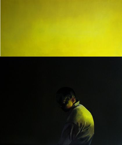
Dans ses portraits, comme dans les « Peintures sur table », on retrouve cette question de l’atemporalité en même temps que la superposition historique des procédés et des manières. Atemporalité : Malgré quelqu’indice- une aura de lumière bleutée qui pourrait être celle d’un ordinateur et renvoyer alors à notre modernité-, le personnage, réalisé à l’échelle humaine, pourrait tout aussi bien sortir d’une peinture hollandaise, ou d’un tableau de Hopper, depuis le rendu en clair obscur jusqu’à son attitude méditative, donnant à l’œuvre une étrange impression de silence. Le dépouillement des fonds, aplats de couleurs sourdes, renforce cette sensation de mise entre parenthèse du monde objectif, d’une sorte de suspension du rapport du sujet à toute réalité ordinaire, une sorte d’épochè, donc, hors du temps calculé, dans le temps indécis de la méditation, du retrait, du repli sur soi…La mise en échelle 1 du portrait s’en fait paradoxale, car tout en se donnant naturellement en tentation de miroir, elle nous pose face à un être qui « esquive le regard » pour reprendre les mots de l’artiste, impénétrable, inaccessible, en retraite. Le déploiement de certaines œuvres en diptyque ou triptyque démultiplie les vues possibles, les relations entre les images, en complexifiant l’abord. Superposition des procédés : le sujet, au premier plan, se détache sur un fond minimal, décontextualisé par l’arrière-champ coloré, sert en premier lieu un souci d’épure de la représentation. A la rigueur des aplats monochromes ou en subtile polychromie, suggérant l’art abstrait ou conceptuel, répond le traitement apparemment classique des personnages, évoquant l’art classique du portrait, le thème de la figure. Pour l’artiste, il s’agit de concilier deux moments de l’histoire de l’art dans le même tableau. Bien plus encore, l’utilisation d’un logiciel de retouche et de traitement de l’image, permettant la « recomposition » du modèle, puis le processus de « pictorialisation » d’une image arrêtée issue de captation vidéo par la peinture offrent, outre un trouble hyperréaliste, la rencontre (plutôt que la confrontation) entre des techniques des plus contemporaines et la peinture à l’huile, dans un passage à rebours. Manière d’affirmer que la peinture est susceptible de laisser émerger une émotion que la photographie ignore. Manière aussi de se réapproprier plastiquement et physiquement l’objet de création. Ce lien au temps, qui nous semble si essentiel dans la peinture de Emmanuelle Leblanc, se manifeste aussi dans la durée du faire, de la confrontation à la matière, matière picturale et matériau. Si elle oeuvre à partir de photographies, ou de vidéos, son travail n’est pas pour autant dématérialisé. Préparer les surfaces, peindre à l’huile, recomposer les images ouvre un rapport au temps autant qu’à l’histoire de l’art, en terme de représentation mais aussi de savoir-faire. Comment dire autrement les limites de la virtualité ?
Vu du dehors ou en prise avec son intériorité, l’oeuvre d’Emmanuelle Leblanc est un univers suspendu entre deux rives, qui ne conforte aucune vision du monde ni ne le nie, mais cherche à se saisir subjectivement de son caractère fugitif, évanescent et mouvant, pour ensuite s’en dessaisir, comme deux moments d’une même quête irrésolue.
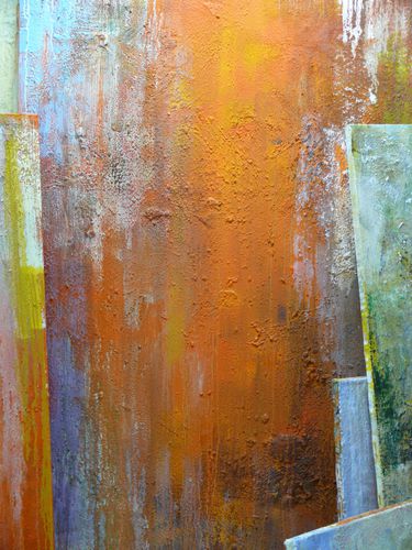
"Buttercup" - diptyque- huile sur toile - 180x150 cm-


 Yassine Balbzioui présente, avec « The fish inside me », un ensemble de peintures, photographies, aquarelles et vidéos, donnant à voir un panorama complet de ses pratiques et de son univers.
 Mais l’hyperbole, construite avec humour et ironie, retourne tout pessimisme en rire salvateur. « Le rire causé par le grotesque a en soi quelque chose de profond, d'axiomatique et de primitif » disait Baudelaire (3). Yassine Balbzioui a compris en quoi la nature même du déguisement est comique, qui, se détachant du « corps habituel », pour reprendre l’expression de Bergson (4), produit le décalage et l’inattendu. Il n’hésitera pas à se photographier, masque de poisson sur le visage, émergeant du fleuve Niger après avoir pêché un de ses semblables, ou gisant dans les décombres tel un poisson mort, ou encore, comme dans la vidéo « The fish inside me », ramant tant bien que mal dans sa baignoire d’enfant pour atteindre quelque rivage impossible.